
02 / Overview
Overview
My work spans across communication, design and development, however, showing finished projects alone did not explain how these disciplines connect. I needed a platform where someone could see both what I made and the thinking behind it, whether they were considering hiring me, starting a project, or exploring possible collaborations. This need shaped this portfolio. A public site for presenting my work and a private dashboard for keeping it current.
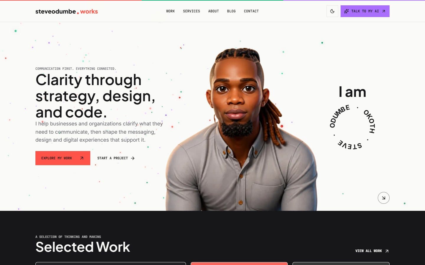
I built this portfolio around a simple idea, clarity through design, strategy, and code. That meant start with what different visitors needed to understand, rather than arranging pages around my skills alone. For someone considering a project, they can explore my servicea and get in touch, an employer can examine my experience and the decisions behind my work. I choose to give substantial projects detailed case studies because a finished screen cannot show the research, communication choices, and trade-offs that let to it.
I chose to keep the navigation compact and use color and motion that would give the site a personality while still making the content easy to follow. These decisions helped me turn the portfolio into an explanation of how I choose to work, not just a collection of things I have made.
I started with the identity. I developed a logo for my portfolio and used steveodumbe.works name throughout the site so the work would feel connected to a recognizable personal practice. I wanted the design to feel confident and creative while allowing ample room for the projects and writing to speak for themselves.
The color palette gave me a way to express the different parts of my work. Coral brings attention to communication and key actions. Emerald adds a sense of progress and balance. Lavendar appears around technology and interactive experiences. I selected neutral backgrounds and text to keep the pages readable, with color appearing at deliberate moments rather than competing with the content.
Typography helped me establish the same balance. I chose Plus Jakarta Sans for headings, Inter for body copy, and JetBrains Mono for labels, buttons, and interface details. Together, they give the site a clear reading hierarchy while allowing its more technical side to show through.
I built the public site to let visitos explore my portfolio at different depths. Someone can scan the work, sevices, and experience pages quickly; someone evaluating a project more closely can read a case study and follow the decisions behind it. I also build a private dashboard so I could be updating my projects, articles, edia, and enquiries as the portfolio grows.
For implementation, I used Next.js, TypeScript, Tailwind CSS and Shadcn/ui to build the interface, with Neon for data, Cloudinary for media, Better Auth for access, Resend for email, and Vercel for deployment. I used Codex as to assist in development, directing the work, reviewing the results, and testing the flows. The site is live, and my current challenge is building the AI assistant into a useful experience that can understand a visitor's needs and guide them towards the right conversation. That feature is still in development, with delivery planned soon.
03 / Contribution
My Role and Scope
My role
Product Strategy, Communication Strategy, UX/UI Design, Full Stack Development, Technical SEO
Audience
Freelance Clients, NGOs and Social Impact Organizations, Employers, Potential Collaborators, Peers and Readers
Deliverables
Website, Custom CMS, SEO Foundations, Production deployment on custom domain
06 / Intended outcome
Outcome
This portfolio is live. Visitors can explore my work, real about the decisions behind it, and contact me about projects, hiring, or collaboration. I can publish and update content through the dashboard, manage enquiries and CV requests, and review reader feedback. This has provided me with a working platform for presenting my practice and keeping it current. I am now using the live site to gather feedback, improve the experience, and develop the AI assistant as the next part of the system.